The tag pane shows the tag elements in a list structure. A wizard is started to help you create new elements. To update existing elements, simply double-click the item to open the wizard. You can make direct changes to the tag elements in the list by placing the cursor in the list cell or selecting an item from the combo box lists. To ease handling of many items, multiple rows can be selected and changes applied to all selected elements. The list shows all properties of the tag element in a clearly arranged manner. All commands available in this pane are directly accessible from the toolbar or pop-up menu.
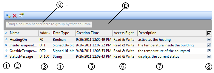
Column number |
Column Header |
Explanation |
|---|---|---|
(1) |
|
Shows the status of the element:
Hint: check the tool tip for help on configuring the element correctly.  |
(2) |
Name |
Shows the tag's name Each tag element that is child to the same parent must have a unique tag name, e.g. only one tag can be named "OutsideTemperature". |
(3) |
Address |
Shows the element's address |
(4) |
Data Type |
Shows the element's data type |
(5) |
Creation Time |
Displays the creation time and date |
(6) |
Access Right |
Shows the access rights of the tag |
(7) |
Description |
Allows you to enter a description for the tag |
(8) |
 |
You can disable elements by deactivating this check box (multiple selection with <Ctrl> and/or <Shift>). Disabled elements are not visible inside the OPC client. |


Arrange elements in meaningful groups
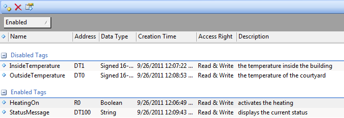
For example, you wish to group elements by their enabled or disabled state. Simply drag the column (8) header inside the field "Drag a column header …" (9).
You can also sort the list of tag items by simply clicking on the column header (10).
To deselect multiple selected rows, simply click into column (1), (2) or (3). Only the currently selected row will remain selected.